Your login information returned multiple users. Please select the user you would like to log in as and re-type in your password.
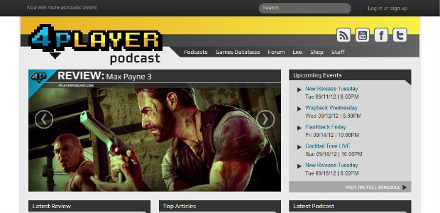

As many of you may know, we are currently working on a new website to host all of our 4Player Podcast content. Details about the site have been short in coming aside from various tidbits dropped during podcasts or live streams, so I'd like to take this opportunity to begin to introduce you to 4Player's new home. First off, let's answer a few questions.
Why the new site? What's wrong with the current one?
Quite frankly, 4Player Podcast has grown beyond the original concepts of its founding members and has become a community driven gaming website. We want to foster this growth and continue to provide candid opinions, live gaming streams and a place for our community. With growth, there are growing pains and the biggest one we're currently feeling is with our website.
Our biggest complaint with the current site is that it's a blog. Don't get me wrong, there's nothing wrong with blogs. This certainly is a great place for ourselves and our community to interact but we've grown so much that a simple blog can no longer contain everything that we do. We want to have a website that can grow with us and our current WordPress blog isn't cutting it. Our main goal with the new site is to provide a way for you to easily find the content you want and to discover new content you may have not known was there.
When will it be finished?
The new site will never truly be finished because we plan on continuing adding new features to it as we further to development the 4Player community. As of now, we are tentatively running with an "October 1st" launch date for the first phase of the new site.
What major improvements have been made?
We've listened to your feedback and have designed a new site that fixes a lot of problems and complaints people have brought to our attention. We'll no longer look like a small media news blog, but a fully fledged gaming community site. You will only need one account to access and interact with all parts of the website. There is an improved event calendar so you can see when we're broadcasting in your current timezone. We've also made the new live page worth visiting by implementing a ton of great features and preferences. These are just a handful of the improvements being made.
In the next few weeks will be showcasing a couple features of the new site, giving you details about how they work along with screenshots or videos of them in action. Remember that a few of these things are subject to change as we continue to improve on the design and add new features.
Comments
13 years, 3 months ago
Wow that is really easy on the eyes and looks very very accessible! Good job with this you guys!
13 years, 3 months ago
that actually looks really awesome. clean, accessible, stylish, loving it.
will the accounts we already have work? can we use them to do other stuff beyond commenting?
13 years, 3 months ago
I can't wait! Bring on October
13 years, 3 months ago
"There is an improved event calendar so you can see when we’re broadcasting in your current timezone." Years of raining and experience wasted, but with a website that sexy I can deal with it.
13 years, 3 months ago
"You will only need one account to access and interact with all parts of the website." Does this mean you guys will be doing away with word press and allowing us to use our Forum accounts to sign into the main site?
Or will all forum goers have to re-register? I know a few people don't wanna lose their forum numbers/posts etc. and I can see why. Hollah back dawwwwg~ :D
13 years, 3 months ago
New site looks really nice. Can't wait for it to go live.
13 years, 3 months ago
Looking forward to it.
13 years, 3 months ago
Cool, a redesign that doesn't "ruin everything". I'd like to get my hands on the database. I like things like that.
13 years, 3 months ago
On October 1st the angels will sing and the triumphant roar of trumpets will be heard throughout the land. This is beautiful.
13 years, 3 months ago
I like the color scheme, well done Mr. Webb.
13 years, 3 months ago
Looks really good. Besides the new features, the screenshot of the new layout looks great. You have form, function, and legibility down very well... and I'm a grid and typography snob. I'm very excited to see it (and also excited to look at your source code when it's up).
13 years, 3 months ago
October 1st is my birthday. WHAT A COINCIDENCE.
13 years, 3 months ago
ooooooooooooooooooooooooooooooooooooooo
13 years, 3 months ago
I think this is another step in the right direction. Good job, guys, I look forward to seeing where this goes.
13 years, 3 months ago
It looks very good! I love the direction you guys are going....
^_^
13 years, 3 months ago
Oh man I can't wait for this new site it looks so great!
13 years, 3 months ago
YES! I have been waiting for this for a long time. I'm glad to see these changes coming. October can not come fast enough. I look forward to the documentary.
13 years, 3 months ago
Love the layout. I have been listening to you guys since I was a freshman in high school and I'm still listening to you now that I am a freshman in college. 4pp was the first gaming podcast I listened to. I'm glad to see you keep moving forward and constantly try to improve. Keep doing what you're doing guys.
13 years, 3 months ago
That screenshot is full of win.
13 years, 3 months ago
That new site is looking very sexy.
I like it.
13 years, 3 months ago
If I don't find Hulk Hogan's Climax Racing anywhere, I'll be severely disappointed.
13 years, 3 months ago
Really excited! Love 4pp's expansion. I was kind of missing the list of members on the right side of the old site where it had the twitter and email info since i can't remember them.
13 years, 3 months ago
Looking good!
13 years, 3 months ago
4PP just keeps getting better. I look forward to the new site, and all of neat features. Keep up all of the fantastic work.
13 years, 3 months ago
Looks really amazing, 4playerpodcast is growing...I promised myself I wouldn't cry.
13 years, 3 months ago
Colour scheme is great ^^
Looking good.
13 years, 3 months ago
Awesome! I've been getting really excited for the new site just listening to you guys talk about it and this has made me even more thrilled.
13 years, 3 months ago
I've been a part of 4PP for 5 years and it has always been great to see them take another step.
13 years, 3 months ago
That preview makes it look much more professional, which by the way is a great thing. Can't wait for the launch to fully see it.
13 years, 3 months ago
one log in for the forums as well ?
13 years, 2 months ago
Hey guys great good job :D I'm really enjoying this new site, looking good indeed.