Your login information returned multiple users. Please select the user you would like to log in as and re-type in your password.
Do you feel that brightness starting to crisp up your back? If you do it can only mean one thing, the Xbox Live Summer of Arcade is starting to bear down. This E3 I was able to get my hands on a hearty playthrough of Tequila Work's Deadlight, a zombie survival platformer that's been on my radar for a few months now.
You play the story of a survivor during a zombie apocalypse in Seattle Washington, who separates from his group in order to reach a military safe house after an altercation with the people he was previously holed up with. Once leaving the somewhat precarious safety of his original location he is thrust out into a world of zombies, platforms, environmental hazards and puzzles.
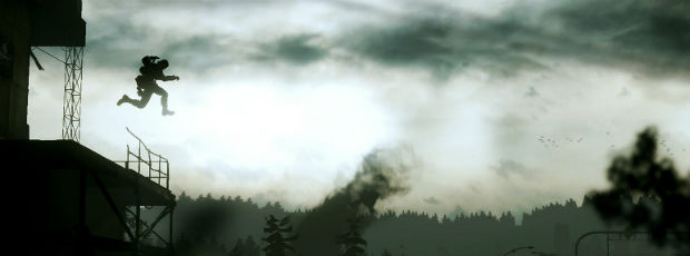
Of course the first noticeable thing in Deadlight is the art style. It is presented in stark shades and silhouettes beneath rainy skies and dessicated buildings. It oozes sadness and desperation, and also makes heavy use of Seattle-esque imagery which adds a good amount of personality to the local and keeps it from seeming as if it's nothing more than a faceless apocalyptic backdrop. If I was to compare the visual style to any game, a more detailed Limbo comes to mind, and it certainly has a high quality sound design to match. This is a game best played with headphones in the dark, an experience I look forward to testing far away from the bright lights and random scream synonymous with E3.
The similarities with Limbo don't just stop with the visual style. When I first saw Deadlight in action I was under the impression that it would play like a metroidvania such as Shadow Complex. In fact, it much more resembles a screen by screen puzzler like Flashpoint, the sequel to Out of this World which the developers pointed to as a direct inspiration, or Limbo (to use a contemporary example). And truly, playing Deadlight feels like playing a classic PC platformer from the mid 90's with all of the tension and enemy management intact.
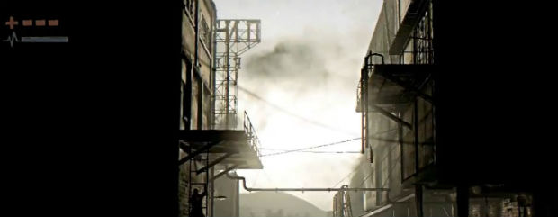
"Enemy management" you say? Indeed! Deadlight, like its source material, makes heavy use of putting the main character in difficult situations which often requires running past enemies at the right time rather than fighting them. The main weapon I had was an axe, which proved somewhat unwieldy and only reliable in short bursts due to the stamina drain the character experiences. Stamina, which is effected by almost everything, is the main gauge of concern besides health, and it drains when you're doing anything besides standing still or sprinting. Much like I Am Alive, all platforming, climbing, fighting, running, and even hanging from a ledge, drains it. Once it runs out you're completely defenseless, so stamina management is an important part of the game. And it makes sense. A game like Deadlight wouldn't be nearly as stressful if you could climb about on ledges over carnivorous walking dead with humble abandon with no worry. But adding human constitution into the mix really adds another layer to what would otherwise be a fairly simple, and perhaps dull, method of traversal through the levels.
Health is the other gauge of concern, and the player begins with 4 bars of it. Health packs are littered about the level in secret areas but the main character is only limited to holding a few at a time. Get bit by a zombie and you'll have a chance to throw him off, but not without losing a bar of health or two in the process. It's typical health management, but it works for the game.
Some things, however, kind of don't.
As immersive as Deadlight tries to be, it also does some things which completely pull the player out of the atmosphere. All the ledges you can traverse will have a little white hand icon over them, showing you that they are climbable. While this may be somewhat convenient, it should also be completely unnecessary. The same goes for when there are breakable doors, which will have a large red 'break' icon over them, or when you are being grabbed by a zombie , which will display a big flashing B-button sign. It completely destroyes the atmosphere and really should have all been either displayed in a more subtle way, in the case of the zombie grab, or not displayed at all.
The problem is, as good as the art style of Deadlight is, it's displayed in such a low resolution that perhaps some of those ledges just wouldn't be apparent without them. Jaggies are more numerous than zombies in this apocalyptic nightmare and tends to really blur up the background at times. It's strange, because as good as the art style is, it's fairly simple and would have benefited remarkably from a high resolution offering. It may seem like a shallow critique, but when it results in white hand icons littering the otherwise fantastic atmosphere, a real problem presents itself.
Overall, however, Deadlight is a good addition to this summers arcade orgy of smorgasbord flesh-pit, or whatever it is they're calling it now, and I intend on being a part of it. Will Deadlight be the next Limbo or Shadow Complex? No. But it will be a novel approach to the survival-horror genera that successfully resurrects old mechanics in a fresh wrapping of rotted flesh. Classic gamers will be pleasantly surprised and acolytes might even learn something new.

Comments
13 years, 6 months ago
The hand and break icons do seem like a big problem. I hope they function like the pop up notifications in Left 4 Dead. They show you what and where things are the first couple of times, but disappear later on. Did you guys get to discus the resolution issue with the Devs? Could it have just been that way for the demo or was it the final product that will be shipping?
Overall I'm impressed with the idea of Deadlight, and I think that if it is well executed players will be able to over look the flaws in the visual design choices. Although I could see people who chose to go on a media blackout (or whatever) being disappointed that this is not a true Metroidvania.
13 years, 6 months ago
Aww I was hoping for another metroid-vania.
13 years, 6 months ago
It's safe to say, my hopes are lost. I was going to buy this Day 1 if it was a metroidvania, it looked so promising. Alas, all of problems make it look as if it's going to be pretty disappointing.
13 years, 6 months ago
Hmm that hand icon seems like it will be annoying nonetheless I am definitely getting this game and will most likely enjoy it very much.
13 years, 6 months ago
I'd find the hand icon and mash/tap prompts to be utterly annoying. If a game's premise or initial lure is based on setting a specific tone, anything that would interrupt that would be a glaring flaw. It reminds me of how the voice acting in Heavy Rain really spoiled the environment for me and I could barely remain patient to complete my playthrough.