Your login information returned multiple users. Please select the user you would like to log in as and re-type in your password.
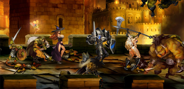

Dragon's Crown, Vanillaware's 2D side-scrolling action RPG, has not featured the largest marketing campaign in recent memory or worked too hard to make much of a splash on its own, but it has attained some degree of publicity thanks to a bit of controversy over the game's hyper-busty female character designs.
The controversy, summarized well in this Forbes article, started with Kotaku's Jason Schreier saying that the character designer must be a teenager. The actual character designer, George Kamitani, responded to Schreier, explaining that not only does the game's exaggerated art style stretch across both men and women, he worked with the already exaggerated designs reminiscent of J.R.R. Tolkien and Dungeons & Dragons and took it in a different direction to make his art stand out.
Now that the cover art has released, does this issue remain?
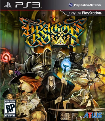
What we have on display here is interesting. The female characters are turned away, hiding what had been arguably the most controversial part of the game's character designs, and one can't help but wonder if this is an intentional response to the controversy. The art style's popping colors, quite original paintbrush-esque art style, and "exaggerated fantasy" look are still quite present, but I would say hiding away the titilation was a smart response if only because it allows the viewer to dwell on more than just that.
My own stance on the designs falls somewhere in between. I stand by Rock Paper Shotgun's manifesto on misogyny in the industry and the fact that game journalists should not shut up about it, but in this respect, I do wonder if that's what I'm seeing. Maybe it's just me and maybe I don't grasp the dark depths of the internet's fetishes, but I personally can't find what's attractive about a sorceress with a chest the size of her head three times over or an Amazonian warrior with a terrifying level of musculature, and I know my girlfriend isn't begging me to one day look like a dwarf shaped like a rectangle of raw muscle.
This is a fascinating, incredibly subjective discussion about the line between stylization and misogyny in video games, and I would love to know what you all think of where this stands. For now, I'll still be scratching my head over why this little game is stirring up trouble but we all give Dead or Alive a sort of shrug.

Comments
12 years, 7 months ago
Sexist? No.
Smart? Fuck yeah.
12 years, 7 months ago
Sexual does not necessarily equal sexist.
12 years, 7 months ago
Not really feeling the cover art on the US version. It really does feel like a response to all the backlash it has been getting, unfortunately. Like this article said, it's basically hiding a majority of the body of the characters and thus takes away from Kamitani's art style. Interesting how the US version has the Wizard in the front, but in all the trailers, the Sorceress is the one in the front.
Sidenote: The cover art reminds me alot of Odin's Sphere cover art with character placement.
12 years, 7 months ago
the cover is not sexist. I hope there is a reversible cover that does make it so..
lol
12 years, 7 months ago
They should have copied the Catherine cover. I want to see the dwarf drown in her cleavage.
12 years, 7 months ago
Who cares? Big boobs are awesome.
12 years, 7 months ago
I would feel kinda bad if they did in fact make the cover art like that because everyone was up in arms, it's a little mean to the artist....
12 years, 7 months ago
I think it has more to do with public censorship. Last thing they need is those overprotective parents seeing the super sexualised characters on the cover. Then we end up seeing more stupid ass articles on Kotaku and so on.
12 years, 7 months ago
Problem solved, so the ladies should be crawling all over this game right? I mean they love all the magic and skeletons and goblins and the fantasy stuff right? Anyway I'm not saying being misogynistic is ok but if they don't want to appeal to a female demographic why force them to, if they want to make a game aimed at males and have characters with huge breasts then go nuts, its their game.
12 years, 7 months ago
People like to moan about everything. I hope this cover is reversible and on the left pane is the woman with big breasts and on the right is that picture of those big burly dwarves the guy shown cuddling each other just to shut all the cry babies up.
12 years, 6 months ago
A creating a character that shows a lot of skin doesn't make them sexist, at least not to me. However, putting that character in a pose where they're shoving their staff between their butt cheeks while rubbing their boobs up against a skeleton is. Also having a character walk around with their spine bent so their butt sticks out like a cat in heat is also a bit sexist. I don't care if the amazon walks around naked or if the box art is nothing but the sorceress' big ol' boobies, that isn't the problem I have. If you're gonna portray your characters as sexual objects, at least have the balls to admit it.
Design wise, the sorceress and the elf don't even look like stylized like the rest of the characters. The sorceress' boobs shouldn't even be able to stay in her dress, he would have been better off just putting some pasties over her nipples. Would have made her look less generic as well, the character designs I've seen in this game have actually been pretty bland to me so far.