Your login information returned multiple users. Please select the user you would like to log in as and re-type in your password.
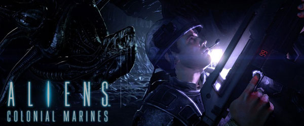 Gearbox certainly has had their hands full for some time now. Aside from producing a hit RPG/Shooter (Borderlands), a new entry their flagship Brothers in Arms franchise, as well as reviving the dying Duke Nukem IP, they have also been hush-hush about another high-profile project for several years now. Aliens Colonial Marines, the highly anticipated game adaptation/follow-up to the Sci-Fi classic, Aliens, was finally unveiled by the studio at E3 2011.
With the backing of Twentieth Century Fox and a talented team that is devoted to paying tribute to the popular series, Colonial Marines is certainly worth keeping an eye on. Unfortunately, the game still has no concrete release date thanks to several vague delay announcements. Luckily, that hasn't stopped the studio from unveiling their sweet new box art for the game:
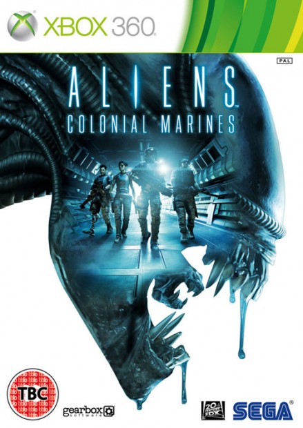
Aliens: Colonial Marines launches in Fall 2012. This box art will presumably be featured on all major platforms.



Comments
13 years, 10 months ago
Lets just hope they bring the franchise to its memorable alien experience
13 years, 10 months ago
Pretty cool. I'm still shaky on the game but that is pretty nifty box art there.
13 years, 10 months ago
Hmm. I like. Has anyone wondered how ugly and out of place that 360 logo is?
13 years, 10 months ago
Kinda alright? I don't really like the "empty space" the white background makes.
13 years, 10 months ago
Ya the empty space seems odd.
13 years, 10 months ago
I like it. I prefer this over some of the other graphically-rich box arts.
If the name doesn't say what the game is about, the box art should give some good hints.
13 years, 10 months ago
Woah, I actually like this box art. Very sleek.
13 years, 10 months ago
I feel as if it's just too bright for an Alien's game. Alien's should evoke feelings of claustrophobia, loneliness and fear. This art isn't really doing it for me.
13 years, 10 months ago
I believe there is an error in the article; "This box is art". Should it be "This box art"?
13 years, 10 months ago
It does look a bit like the Alpha Protocol color-scheme, doesn't it...