Your login information returned multiple users. Please select the user you would like to log in as and re-type in your password.
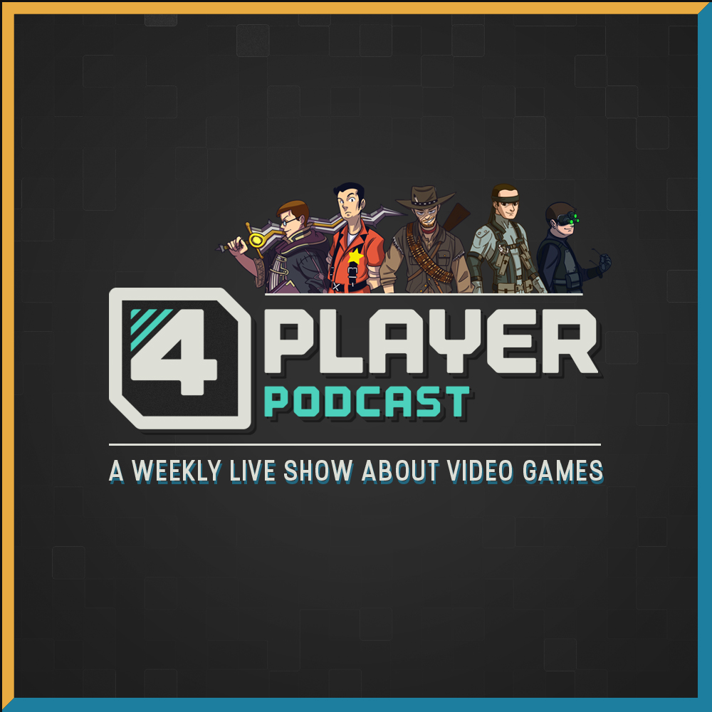
![]() As we approach the new year, there are a lot of changes... or lets call them enhancements that we hope to make in the coming months. We have been taking a long hard look at every element of what we do and thought of ways to improve them. Of course, these kinds of things take time and resources and the process is going to be a long one. We have been sitting on this for a while now but the time has come to bring one of those changes to the forefront.
As we approach the new year, there are a lot of changes... or lets call them enhancements that we hope to make in the coming months. We have been taking a long hard look at every element of what we do and thought of ways to improve them. Of course, these kinds of things take time and resources and the process is going to be a long one. We have been sitting on this for a while now but the time has come to bring one of those changes to the forefront.
Consider this a sneak peek at what's to come... I give you, the new 4Player logo! Thanks for standing by us and we hope that the changes that we have planned will be embraced by the members of this wonderful community. Cheers!
**Special thanks to my girlfriend, Ami for making the logo and putting up with us during the design process!**
Comments
14 years, 1 month ago
Sexy.
14 years, 1 month ago
What's with the little white V-shape?
14 years, 1 month ago
I will miss the old logo. But, I'm exited for change!
14 years, 1 month ago
Getting Minecraft vibes from this for some reason... anyways, good work here. It'll do.
14 years, 1 month ago
I also have to say the little white "V" seems unnecessary. The logo would look much cleaner without it. (I'm majoring in Graphic Design and have done a lot of work with logos).
14 years, 1 month ago
Far out.
14 years, 1 month ago
Nice Logo....this comment was enforced by ikusa cause he is a bitch
14 years, 1 month ago
What..
(I like the retro look though. Didn't see it coming.)
14 years, 1 month ago
I really dig the style. Great work!
14 years, 1 month ago
I like the new logo! The old one was good too, but this one does give off more of a Video game theme than the last one did.
14 years, 1 month ago
I approve. Love this so much.
14 years, 1 month ago
Looking good! Perhaps it would look/sound better as just "4player" though and finally dropping the "podcast" part? ...or maybe putting it as the start of a smaller tagline, "podcasts, videogame news, and reviews etc.", or something. That way people won't confuse it as part of the title, and just be like "check out the new review over at 4player!". "4playerpodcast", as much as we all love it, is a bit of a mouthful...
14 years, 1 month ago
I think the new logo looks really cool and better than the old one. The fact that "player" is all in capitals and in retro fonts and "podcast" in minuscules looks nicer and more pro.
14 years, 1 month ago
Looks fantastic.
14 years, 1 month ago
I love it! Great work.
14 years, 1 month ago
I like it. I also like change, especially when this change comes in the form of a logo that hadn't been changed for about two years. Works for me.
14 years, 1 month ago
When I saw the announcement on twitter I thought "oh man, this is gonna suck.."
I thought wrong. This is fucking great :')
Props to whoever made it
14 years, 1 month ago
I think the new logo looks great. The style is what really makes it work.
14 years, 1 month ago
the logo is really cool and retro, I like it ^^
gives more emphasis on the 4Player too, which is good since you have --since doing more than podcasting-- been wanting to get the confusion of the "podcast" in the name out.
I think design wise this is really cool, I liked the old one,but there's a certain simplicity and stylistic flare to this one.
14 years, 1 month ago
I Love it! I look at this new banner with pride. I hope these next future changes make the website look a lot better.
14 years, 1 month ago
I know u guys r trying to get away from the "podcast" thing, but i see it as kind of futile seeing as the url is (4playerpodcast) and (4pp) being very recognized as this site. (4p) on the other hand is not well known at all.....i thought when the whole name change was being selected, it was gonna be a different name. Oh well i like the title, but it doesnt seem to blend in well with the rest of the stuff on the site compared to the older one.
14 years, 1 month ago
Shiny Captain.
14 years, 1 month ago
As the first comment said "sexy". That is pretty much spot on. :D
14 years, 1 month ago
It looks so good.
14 years, 1 month ago
Very slick, very sexy
14 years, 1 month ago
That Looks Awesome
14 years, 1 month ago
Looks pretty awesome. Put it on the forums already!
14 years, 1 month ago
I love it!!
Great work Ami :)
14 years, 1 month ago
Reminds me of Scott Pilgram vs the World game, very nice.
14 years, 1 month ago
Love it! Looks great
14 years, 1 month ago
I like it.
14 years, 1 month ago
I like it a lot!
Hopefully the improvements to the site will include the return of the Top 5 Podcast...
14 years, 1 month ago
Love it! Ami did an amazing job.
14 years, 1 month ago
You have one clever lady, Nick! This is very retro, i love it!
14 years, 1 month ago
Oh my god I love this logo!
SO GOOD!
14 years, 1 month ago
I like everything but the "podcast."
It looks like it's thrown in there and it doesn't seem to fit with the rest of the design. The font choice is a littler peculiar, as well as the positioning.
Scrap the "podcast" and call yourselves 4Player; you're not limited by the podcast.
14 years, 1 month ago
Love the logo!
14 years, 1 month ago
Me likey!
14 years, 1 month ago
Yep, definitely fitting. Wonder what else is to come? :O
14 years, 1 month ago
Cool logo. I'd recommend making a forum version too though.
14 years, 1 month ago
I like the old one better, but i think a new logo is a good idea : ).
14 years, 1 month ago
Looks pretty awesome. Kinda' makes we want to play some arcade game...
*boots up Scott Pilgrim Vs. The World*
14 years, 1 month ago
The old logo looks more current gen. lol
This new one is nice though, gives off a nostalgic feel.
14 years, 1 month ago
I've already forgotten what the old logo looked like :o
14 years, 1 month ago
Hnng~
14 years, 1 month ago
I like the logo! I hope you will make a new promo video that is as good as the last one, because damn that is an awesome video!
14 years, 1 month ago
Lookin good, can't wait to see the rest of the foretold changes
14 years, 1 month ago
It looks really nice. Kind of a throwback to the first year you guys started doing the podcast. The 8 bit design looks really nice too. Kudos, Ami! Anyhoo, I really like it, and I can't wait seeing what you guys have in store for all of your fans.
14 years, 1 month ago
I really like the new logo. Smart fun and clever with its clear gaming references. Works really well and i look forward to seeing the further new updates you guys roll out.
*hats off to you*