Your login information returned multiple users. Please select the user you would like to log in as and re-type in your password.
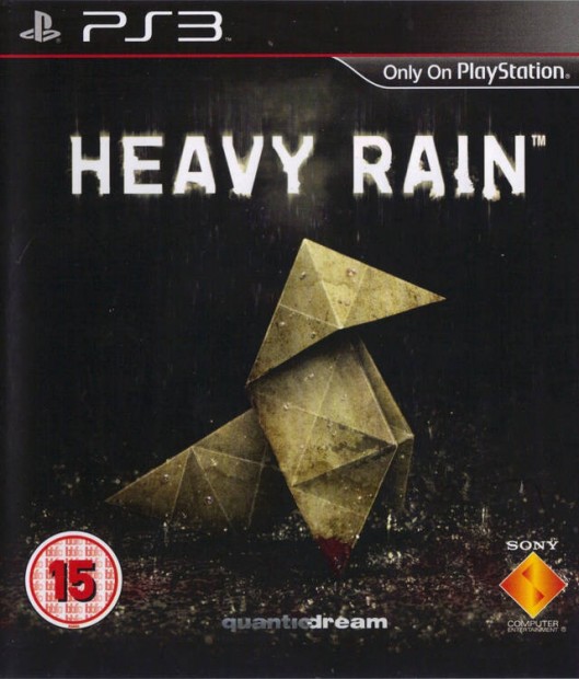
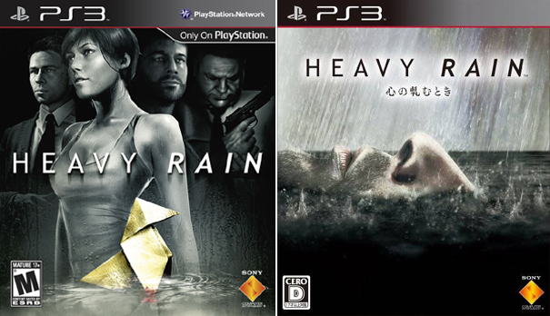 After recently finishing L.A. Noire, I was reminded of similarities with Heavy Rain. Both had heavy detective elements but I still say Heavy Rain was the more innovative game. So I decided to take a look back on the cover art for the releases in the US, Europe, and Japan. Above are both the region one and the region two releases. I think it's obvious to tell which is from Japan and which is from here. I can't say that I'm a fan of the Japan release. I guess it kind of makes sense according to plot, but what is a person supposed to think when seeing this cover? With no understanding of the killer or his methods, this just looks like a weird face being rained on. I'd assume that the person was already dead.
The US release is pretty typical though. Girl in front appealing to the guys. Other dudes in the background. I didn't even notice that there was a piece of origami sitting there until I started this write up. The only thing that I can think of is how to use this cover to market the game as a serial killer murder mystery. I don't feel like any of the covers do that. Maybe it should have a bunch of pictures of people from the game that look like wanted posters on the top. It would say...
"Four chances...."
"To Catch One Killer"
"Can you figure out who it is?"
I'd have to see a mock up, but what do you think? Ultimately, out of the ones that actually exist, I think the European version is best.
Previous Comparison: Okamiden

Comments
14 years, 6 months ago
#1 European ver
#2 Japanese ver
#3 US ver
14 years, 6 months ago
Yes I was happy with cover we got in Europe & the rain effect on LE ver was nice although I wish it was a steel case not cardboard, mine got a lil scuffed up.
14 years, 6 months ago
Simplicity reigns supreme.
14 years, 6 months ago
I love the european version. I'm happy I got the game with that cover art :)
14 years, 6 months ago
http://www.vgboxart.com/boxes/PS3/41879_heavy_rain-print.png
14 years, 6 months ago
I prefer the US version, not because of what's her face, but because it just seems more professional than the Euro one. The Euro one seems weird, maybe it's just that version that you got, but it just isn't that great imo.
14 years, 6 months ago
The US cover Arts for games tend to suck, except for a select few, so I am not surprised in the least. Heres a link for Japanese vs US box art: http://www.gamesradar.com/f/why-japanese-box-art-is-better/a-20080729123833874037
14 years, 6 months ago
Japanese cover takes the title to literal... While the EU is still the best.
14 years, 6 months ago
If you have no knowledge of the game I'd say US one is better, yes you see the typically characters standing around so one of them might pull you while the origami incites some kind of mystery. What does the origami do with the game? Why is it only thing in color?
European looks great but now your thinking it's about origami's in the rain. That thought isn't far fetched in the video game universe after all.
Japanese one has a similar problem to the European one, but won't be disappointed when the game has lots of rain in it. Just doesn't have Rain in it.
14 years, 6 months ago
I don't understand why so many people don't like the US cover; I think it looks just fine. I like all 3 covers, actually. The Japanese one is pretty unique and I think that's pretty cool. :) Besides, it's just the cover anyways. Heavy Rain as a game is awesome. ^_^
14 years, 6 months ago
My favorite game of 2010 and I had to deal with the worst cover art. I would of loved to have any other cover released just about. Such a failure for the U.S
14 years, 6 months ago
I personally like the Japanese version because it displays that feeling of drowning I got while playing. As in I was never in complete control of the situation around me, I was constantly fighting to survive while trying to figure out who the murderer was.
14 years, 6 months ago
What is with the Japanese one, man? I've never played Heavy Rain, aside from the demo on PSN, so I have absolutely no clue how that relates to.. well.. anything.
14 years, 6 months ago
gotta go with the Japan cover here, and the Euro version in a close second, the US version unfortunately doesn't really even compare : \ idk something seems cliché about it
14 years, 6 months ago
Yup; Dat European box art :D
14 years, 6 months ago
I like the European version the most. It has a "The murderer is with you. Discover who he is and put an end to him, or it'll be too late for you to save anybody" feeling, as well as mystery.
I have to say that I disliked the japanese version the most, it had mystery in there, but the objective of it just felt unclear.
That is just my opinion though.
14 years, 6 months ago
The european one is by far the best, but i dont understand why European and American box art are different. Is the culture gap really that big? it varies from game to game which cover art is cooler, but ive never seen a european piece of box art and gone "huh?" like i have with japanese cover art.
14 years, 6 months ago
i agree with you david
14 years, 6 months ago
Got to say who really gives a damn, its cover art, the game is a good game, of course the game has flaws but does cover art really make a difference. if any person says, oh this box looks really nice i'm gonna buy this game, well if they do there not really a gamer. a gamer always does the research. don't get me wrong i really like the game and i think people should at least give it a try. is this make no sense I'm sorry I'm very drunk. all i'm trying to say people should try the game before they judge the cover.
14 years, 6 months ago
oh yeah i'm from England
14 years, 6 months ago
I reckon the Japanese art would have made more sense if they didn't cut stuff out of the game. There were meant to be actual underwater sequences with Ethan. They were meant to link to his nightmares of drowning and possibly justify his black outs. I wish they'd make a directors cut version. Or at least give us the other DLC.
But yeah I'd have to go with the Euro one. Then the Japanese one. The American one last if for no other reason than I don't like Madison. She's shallow and slutty and generally doesn't make sense. Frankly I'd prefer the game without her all together. I can see it now. Norman takes over her plot points. It'd make sense for him to be investigating leads and showing up at serial killers houses. Ethan could easily enough treat his own wounds. It could be set up like the finger sequence, but with pills and bandages.
Or if you just have to have a lady, simply replace Madison with Ethan's wife. She'd be living alone and traumatised by her loss. She'd get called into the police station and decide to team up with her ex-husband. He'd follow the oragami while she'd take the more sensible route and investigate leads and stuff. She'd go on to see how hard Ethan is trying and bring herself to forgive him and ultimately fall back in love with him. Then she'd try her hardest to discover the killer and location of her son before Ethan gets himself killed on the final trials.
Now all I need to do is re-play the game and see if Madison can die. :D
14 years, 6 months ago
The US version is bland, but it does get the job done in a professional way. I think the Japanese cover is the coolest cover, but I do agree that to someone who has not played the game, it would be very confusing. I think the Europe version is both cool looking (maybe cool is not the right word) and gets the point across.
Some of the above comments were talking about the font, and how the Europe version did not seem as professional as the other two. I understand what they were saying, but I think the font they chose for the Europe version fits the game fine. It is not like the font is so wacky that you cannot take the game (based on the cover art) seriously. I mean it is a dark and gritty game and the font sort of reflects that.
14 years, 6 months ago
"Professional" doesn't necessarily mean "good"
The US cover has a boring composition, there's nothing exciting about it. The Japanese and European version have an emphasis on the foreground image making it dramatic.
14 years, 6 months ago
i agree, though i don't have any problem with the US cover. i'm just a simple guy
14 years, 6 months ago
European is my favourite one. The simpler, the better.
14 years, 6 months ago
Yeah EU release looks much better IMO, simple and yet the message is clear.
14 years, 6 months ago
I like the simplicity of the EU one, myself. This reminds me of a puzzle game called Echochrome and its boxes.
The Japanese: http://media.giantbomb.com/uploads/0/9252/644374-942024_95645_front.jpg
The European: http://media.giantbomb.com/uploads/0/3924/251985-echochrome.jpg
The simplistic yet sophisticated style of that game matches the Japanese cover better. Of course, the US doesn't have one because it was download-only here.
14 years, 6 months ago
Wow, the us cover art is terrible! what happened!?
14 years, 6 months ago
I like the Japanese one best, myself. I thought it was creepy and foreboding, I wish I'd picked it up while I was over there. Then again, god that's a lot of stuff to read/comprehend/QTE all in Japanese.. @_@
I do have the European Limited Edition one as well, it's got a bumpy cover like rain dried on it. Very cool effect.
14 years, 6 months ago
I personally wish we Americans got the tender loving care for Heavy Rain as the Europeans did. Not only did they get the best cover but they were the only region to get a Collectors Edition too.
14 years, 6 months ago
Yeah, I think the European version looks the best.