Your login information returned multiple users. Please select the user you would like to log in as and re-type in your password.
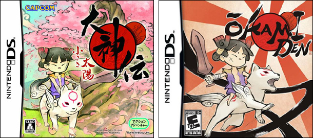
My goodness time goes by fast. All of a sudden I looked up and the last time I did one of these was back in November. Here it is now April. For this week, I decided to do Okamiden. I recently opened my copy and started what I'm sure will be a mixed set of emotions. On the one hand, I'm glad to see the Okami franchise not completely die out, but I can't be 100% happy since Clover is not making the game. That and the game is made for the DS. They've fixed a few of the gripes I had when first initially playing the trade show demos but there will always be that lack of size and scale from the game. I get the chibi heroes for a chibi portable system spin on things, but when I see a little wolf with just a few flowers sprouting up behind him, it's really quite underwhelming. But enough about the game, what about the covers?
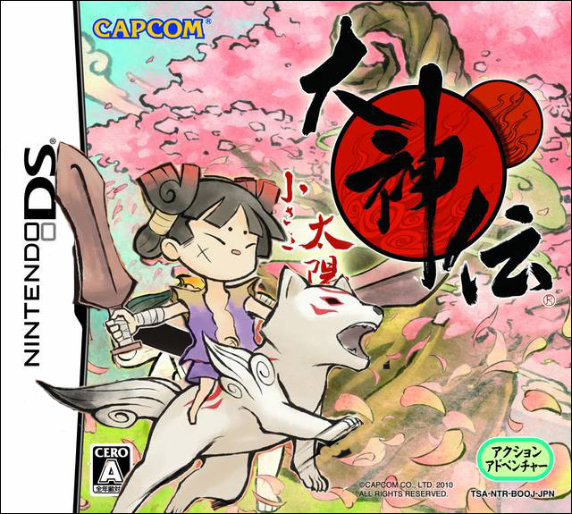
The left cover is obviously the Japanese cover. It was also used for the manual art for the American release. I'd say I like the American release cover due to the more going on but I like the colors and background for the Japanese cover. Here look, I took care of the problem with 15 minutes in photoshop. I'm awesome.
Thanks for reading,
David
Last Comparision: DJ Hero

Comments
14 years, 8 months ago
I must say they both look good. I'm surprised.
14 years, 8 months ago
awful photoshoop is awful :p i do like what you tried to do though. it would have look more appealing to me if that was the actual cover art.
14 years, 8 months ago
Lol.. fifth leg coming out of chibi Amaterasu's stomach.
14 years, 8 months ago
yeah, the david cover is the better cover
14 years, 8 months ago
All that's missing is an IGN waterwark
14 years, 8 months ago
that´s much better .
14 years, 8 months ago
Japan's cover, like always, is better. I really like the flowers and trees that create an overall mythical feel to it.
14 years, 8 months ago
i agree with you david action of the american background of the japanese
14 years, 8 months ago
i like your photoshop cover.
Personally I like the japanese one better. It captures what I felt okami is about, not action or fighting, but the world itself. When I look at it, i focus on the background first, the world of nippon, then i see amaterasu, the being you control and see this world with.
overall, I don't hate the american one but the japanese one just fits with my views on the okami universe.
14 years, 8 months ago
I've seen a few PS2 games that had reversible covers that had the Japanese version on the back and I wish more titles would do this. I would also like to see Catherine have reversible covers since I'll be getting the PS3 version and prefer Katherine personally.
As for Okamiden, I like the original Japanese version better. The angry characters on the US cover just screams of angry Kirby syndrome:
http://www.gamerevolution.com/manifesto/happy-japanese-kirby-angry-american-kirby-987
14 years, 8 months ago
I can't say I prefer either one over the other.
14 years, 8 months ago
Huh, I just noticed that on the Japanese cover, the rider is left-handed and his scar is on his left cheek. On the American cover, it's reversed. Anyways, I like your's best.
14 years, 8 months ago
I like the Japanese cover more but at a glance, the US cover seems to pop and catches your eye. Since the Japanese art is used on the manual of the US game. I'll stick with the US packaging
14 years, 8 months ago
I realy want a DS, to play great games like this, scribblenauts, and Professor Layton, but I can't decide weather or not to get a 3DS, or a cheaper DSi
14 years, 8 months ago
Definitely getting the game!! ^_^
14 years, 6 months ago
[...] Previous Comparison: Okamiden [...]