Your login information returned multiple users. Please select the user you would like to log in as and re-type in your password.
I bet many of you are trying to soak up every bit of Portal 2 you can find. Lucky for you, Valve has officially released the cover-art for their upcoming masterpiece. Rather than just post the art, I figured I would take the opportunity to post it in comparison to the box art for Portal 1 (only released solo on PC with a box).
 |
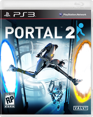 |
It's definitely interesting to watch a small, relatively unknown title like Portal evolve into one of the most widely recognized properties in the industry. In the same way that the original game itself outgrew it's home on the Orange Box disc, the cover art has certainly taken a similar turn. Rather than take the minimalistic approach, ala Portal 1, Portal 2 went all out with multiple characters in an action still. While I like the art because it captures the playful yet dangerous tone of the game itself, there is something really great about the simplistic direction taken by the original. What do you think?



Comments
14 years, 11 months ago
I personally liked the simplistic take of the first cover better. Simple, and I liked how the "O" was replaced with a portal in the title.
I dunno, something about the second games cover is kinda off to me. It might be the tall robot guy jumping from portal to portal and the other robo guy just walking casually in the background. I just feel like it could have been better.
14 years, 11 months ago
I feel as if with the Portal 2 box art they emphasize on the multiplayer too much. However, the Portal 1 box art seems overly simplistic in a sense and doesn't give as much information as what Portal 2 looks like. Maybe a mix would be great.
14 years, 11 months ago
I like both to be honest. The Cover for Portal 2, while not necessarily innovative, looks really nice. Having the figure darker than the surrounding blue helps it pop off the shelf. Also having the focal point be a horizontal figure makes the case look wider (at least to me), which would help it stick out a little more. While it doesn't stand out as well as the PC cover (and honestly I was hoping for something similar this time around) I still enjoy the cover art chosen.
The only problem I can see is the actual title (Portal 2) doesn't really pop to me, but I think the widening of the case and the dark light contrast of the figure would grab someone's attention long enough (even at a passing glance) for them to see the title.
14 years, 11 months ago
Much prefer the first cover, I think it's the anonymity that works, the fact that you don't know who you're playing as until you start playing and you don't know the entire physics of it (obviously portals are involved), whereas with the second one it shows you assumingly that you'll be the robot and it shows the creation of the portals, and for some reason I feel that gives a part of the game away and hence loses it appeal.
Also, as someone said before, by showing both the robots it emphasises the multiplayer mode, ignoring the fact that it probably will be awesome just as a single player game, of course that's if we base this on Portal 1.
14 years, 11 months ago
I think the change in art reflects the kind of game they're trying to make. The original Portal could arguably be considered a simple game, being more linear than it seems, which the cover art portrays, being simple and minimalistic. Possibly, Portal 2 may not as straight forward, having multiple ways to solve the same puzzle, which the cover art suggests. Speculation aside, I prefer the 1st cover and I think it's a shame they didn't continue with that simplistic approach for Portal 2.
14 years, 11 months ago
Oh god that new cover is awful. The minimalism, creativity, and humor of the original Portal is lost in this cover. Looks like a cover for a futuristic football game. Valve has always kinda sucked at covers though -- so no surprise.
14 years, 11 months ago
I prefer the first Portal's cover art just because of its simplistic and humorous nature. (I say humorous because it just reminds me of those danger signs you see every once in a while. Ex: Warning, slippery surface.)
It seems lighthearted in contrast with the dangerous purposes of the experiments that went on.
14 years, 11 months ago
I am ok with this, they are trying to appeal to a larger audience.
14 years, 11 months ago
dude the new cover looks sweet the thing i like most about the old is the O in portal sorry they changed that
14 years, 11 months ago
I won't see it anyhow as I buy Steam version!
14 years, 11 months ago
Wow...that is the first time I have seen the box art for Portal 2. Gotta say. :/ Not a big fan.
It's not terrible, per say, but compositionally I think they could have done a better job and I too, feel like they are putting a huge emphasis on the co-op component. More importantly to me though, is the fact that they seem to have lost what I loved so much about how Valve did their previous covers...
The thing I liked about the first cover so much is that is emphasized the mystery...much in the way you are thrown into the world as an unknowing Chell so did you too not know what what going to happen in this game. Only until later do you see that the cover shows the main mechanic in the game in a way that say, a corporate machine would show in a quick little sign to say 'do this' or 'warning'.
It's a testament to the mood of the game for me. An emotionless cover (that may not be the right word); which is great for that game as for the most part you are the lone human in an emotionless scientific environment ruled by a central computer intelligence. Only until you do a little exploring do you find out the plight of the other humans to have graced the facility before you.
I've always found Valve to take a minimal approach to their game covers and marketing that I have always found admirable. The Half-life 2 cover, the Left 4 Dead cover, the first Portal cover, and their signature itself (I'm speaking about the image of the bald man with the valve attached to the back of his head) are great examples of how Valve tends to make images that leave the audience (or maybe it's just me) wondering about the game behind it.
I can understand that Valve may be trying to gather a bigger audience with this new cover...it certainly is more fun and shows quite literally how the games namesake mechanic works. It's a more contemporary cover style where they try and show what a game is all about in one image.
I still miss the other style though...
14 years, 11 months ago
Looks more like Cyber-ball than Portal
14 years, 11 months ago
i like how simple the first one is....try having the second design on a t-shirt, which is why I've only seen portal 2 shirts with the simple stick-man figure.
14 years, 11 months ago
I definitely like the more minimalistic art of the first game better - but I don't think there's anything wrong with the art for the second game, either.
14 years, 11 months ago
The first cover is simply bliss in comparison to how lunky/uninspired the second one is looking. New cover art FTL
14 years, 11 months ago
They could throw a kitten on the cover art and still sell millions. I think it really just comes down to how much they're trying hide (or reveal) with a total shift to the co-op side. >.>
14 years, 11 months ago
I prefer the simplistic cover art.
14 years, 11 months ago
The first games cover art feels more iconic to me.
When some one dig out that cover from some archive of 00's western culture, that is the cover that will stay in their mind, not some composite action shot like in the second one.
Second one isn't bad, but it's to plain, considering how the first one looked.
14 years, 11 months ago
Even though second one is more general action shot it's more vibrant which I like a lot. I would have preferred more minimalist design but oh well.
14 years, 8 months ago
I am disappointed with the new cover art as it does not represent the game mechanics at all. Instead of illustrating portals, it illustrates simple holes. That sucks.
They have a robot that appears to be jumping from a bright white room, through a blue hole in a wall, across a hallway, through a yellow hole in another wall, and into another bright white room on the opposite side.
Those are not portals. If they were, the view through each would be the same hallway. If they were portals, they would not be leading anywhere. Passing through either would get you to the exact same spot you started from. If they were portals, when the robot went through the yellow, he would come right back out the blue, only having lost a little altitude. You should see his opposite foot through each portal as well.
The only way you could get this snapshot in the game (ignoring the difference in room brightness) is if the robot is moving vertically (rising or falling), not jumping through portals.
There is no 'back' side to portals, no depth of transit between them. The part of you that is passed the plane on one portal is out from the plane on the other. There is no space 'behind' them to span a hallway 'between' the portals.
Someone who has not played the game designed the art. They took cool looking elements and assembled them on the cover. I suppose it is designed to move product, but I think they could have done just as good a cover and actually used portal mechanics.
The cover art is a fail.