Your login information returned multiple users. Please select the user you would like to log in as and re-type in your password.
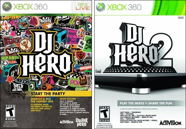 It wasn't until recently that I finally saw the cover for the new DJ Hero game. Maybe I had seen it before but it didn't make an impression on me. But when I saw it there sitting there on the shelf, looking all bored, I realized this title isn't going to do well. There's no surprise that the sequel isn't getting much hype or that it is going to be largely over looked. It isn't getting nearly the promotion that DJ Hero received last year. Gone are the parties, DJs and media events promoting this once promising title. This year Activision decided to save their money and forgo all the extras, I guess even in the box art.
If there was one thing I liked about the original DJ Hero, it was the spirit of the game. It was supposed to be fun and colorful. The beats were alive. The music was loud. And all of this I felt, was perfectly captured in the box art. I may not care for Activision or some of the artists featured in the game, but I could get behind the style DJ Hero was trying to emphasize.
So when saw the box art for the sequel, it was more than just a bummer. I saw a lack of support. I saw a game that was just put out there because they spent all that money the year before. It's bittersweet in a way. I didn't want another "Hero" game to take off. To become this new trend with all the kids spending hours playing and showing off. I don't care to see Activision succeed. But then again DJ Hero was a pretty well made game. There were some good ideas and a quite a few interesting musical concepts. Plus I'm a music game fan. There's not too many games like this that will get green lit, so you learn to take what you can get.
But at this point, the people looking to get DJ Hero 2 have to be previous owners trying to save a buck. They still have the turn-table lying around and are interested in picking up the game by itself for cheap. Too bad it's priced as a all full retail release. Also, too bad that DJ Hero 2's box art doesn't do anything interesting at all.
Peace,
David
Last Week’s Comparision: Mega Man 8
Comments
15 years, 1 month ago
The lack of hype or promotion for DJ Hero 2 could just be because the first one was so popular, Activision might think it doesn't really need it. I don't think that very many people who didn't already own the first would decide to get on the bandwagon now, as you said, the people who will buy this are the ones who already have the turn table from the first.
Also, being a fan of simple cover art, the cover art doesn't really bother me, though I suppose it's not about whether it bothers me, but whether it will help sell the game. I feel that could go both ways. Obviously the people who bought the first, if they liked it, would probably pick up this game regardless of its cover.
I think that having a different cover for the new game is pretty important though. If the cover was the same, DJ Hero 2 with the Guitar Hero lettering, a bunch of stylish colorful stickers, and a few of the more popular songs listed on the front, I think the game might be even more looked over. John Q. Public might walk into the store, glance over at the shelf, and see a DJ Hero box, not noticing the 2 due to sensory overload. So while the cover isn't necessarily interesting, I still think it's simplicity and difference from the prior title might help someone notice the game better as a new title, rather than just the same game from a while back.
I could be completely wrong with my analysis, but that's my two cents I guess.
15 years, 1 month ago
I like the minimalistic second cover better, I like the clean look and the design of it, but I agree with you, it's not as eyecatching, and it's not the one that represents the game best.
"play the mixes, share the fun" also sounds like the most mundane and boring marketing point printed on the box as opposed to the "START THE PARTY!!!" vibe I got from the other one.
15 years, 1 month ago
The second cover could have been better if it still had that graffiti-urban look to it.
15 years, 1 month ago
I never understood sequels to these "Music Hero games." For one, the core mechanics don't change from game to game, it's still about following the on-screen prompts. And two, the only thing that they add to the sequels are more songs. Now, I understand that Activision may need the money, but why not just release the new content in a downloadable form? They could charge money for each separate chunk of the new conent, like a couple songs from the same artist in a single chunk, and another artist in another chunk. And to add onto that, from each new game of the "Music Hero" series, all, or most of the songs that were in previous games are not included in the sequels. So why not have this single huge game with all these songs in it, a game that would benefit from downloadable content?
It's just so bizarre to me.
15 years, 1 month ago
They didn't even show the entire turntable. They could at least have some hands or something scratching on the whole turntable. A cover like that is down right LAZY.
15 years, 1 month ago
Was I really the only person who didn't like DJ Hero? It just was so uninteresting to me. Plus, I thought the old boxart was so cartoony and childish (something I think of with all the Hero games). I dunno, maybe it's just me.
15 years, 1 month ago
I've never played DJ Hero, but I completely, completely agree about the box art and the impression it gives me. That first game looks awesome and fun, and the second one...well, it looks empty. :/ Eh.
15 years, 1 month ago
Wow that cover couldn't look more boring, specially compared to the first game. Just looks like they slapped something on the front and put it on the shelves.
15 years, 1 month ago
Hmmm these two are actually tied for me
15 years, 1 month ago
I had never played any of the DJ Hero games before but they do look like fun. I just don't want to spend so much money for peripherals that will end up filling more closet space, especially because I almost have none.
As for the cover art, the first DJ Hero's art looks to capture almost the "soul" (if I can appropriately use that) of what being a DJ is all about. It's emphasis on style gives it a certain look that reminds me of "Jet Grind Radio", as the DJ Hero 2's art looks like the more clean, corporate look.
Now I'm not completely sure about this but if I'm not mistaken, not only can you tell the difference from the obvious box art, but maybe the new covers also reflect the kind of music that is offered in each game. DJ Hero 2 seems to have more mainstream and popular music from artists where you wouldn't even expect to be in a game like this, which is why I guess most of the music has been remixed for that purpose. I just think it's an interesting thing to take into account.
Bottom line, I kind of like both box art. They both come off showing almost the transition to where music is going nowadays and both have their own "flare" in some way. One is stylish and soulful and the other is clean and sort of futuristic.
14 years, 8 months ago
[...] Last Comparision: DJ Hero [...]