Your login information returned multiple users. Please select the user you would like to log in as and re-type in your password.
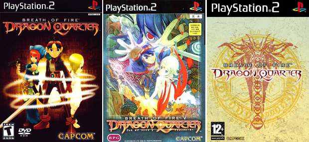 For this weeks comparison, it's a game that I've always wanted to play but haven't because of various reasons. One of them being the D-Counter system. For every move you make in the game, a percentage is added to the D-Counter. Walking, attacking, and special moves all add to this counter, which if you fill before a certain part in the story, the game is over.
Different levels of attack cause varying degrees of damage and the main character even has an attack that will kill a boss in one hit, but it's all dependent on the player to weigh the advantages and disadvantages of speed and strength. I found it to be an incredible idea for an RPG, even though it probably didn't sit so well with a majority of players.
I've always wanted to play this game for this concept and immediately bought the Japanese Version (Center) earlier this year when I saw it sitting on a shelf. I loved the art but after returning to the states I wasn't able to progress in the game because of the language barrier. I own the American release, shown left, but because of my preferences it's still sitting on the shelf. I thought it was pretty obvious which cover I would favor, so I decided to talk about the game rather than try to explain why it was better.
Here is a larger version of the art for those who'd like a closer look.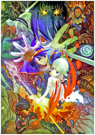 Last Week’s Comparision: Castlevania: Lords of Shadow

Comments
15 years, 2 months ago
Is the one on the right the european version?
15 years, 2 months ago
While normally I'd say the Western version makes sense, the Japanese cover would have definitely made it stand out better. I only wonder if it's so the person won't look at the back and go "Whoa, this game doesn't look like the cover at all dude!"
I played this game as a rental and had to reset twice at one point before finishing the game, it IS an epic game, it's like a reverse dungeon. The game+ after you beat the game was also a unique idea.
15 years, 2 months ago
the idea of the game sounds REALLY interesting but very chalenging too. the idea reminds me of one of the .hack games, infection maybe? where the lead had a move that would do massive ammounts of damage on the enemy and even get rare items, but using it would further the infection and if you get 100% infection, you die. I may try to pick this game up once i get a ps2. i have an entire system im backlogged on. this will be fun.
15 years, 2 months ago
Yeah the European one isn't to bad but the Japanese cover is the most unique and illustrates the game best.
Too bad the US version looks like a poor mans megaman
15 years, 2 months ago
I've never played Dragon Quarter, but that D-Counter system sounds stupid as hell.
15 years, 2 months ago
I absolutely LOVE this game.
15 years, 2 months ago
I'd try it, David. I hear the battle system from Ni No Kuni (PS3) is based on the battle system in this game. Minus the the whole D-Counter thing.
15 years, 2 months ago
I invested like....180+ hours in this game. (Play it David! You'll love it.)
Totally worth it. The D-counter is almost not an issue; you don't NEED to use your dragon form (which ups the D-Counter), though some enemies are harder than others and if you really need to you use it in boss battles as a last resort. I think against Bosch was the only time I ever used it.
That being said, I finished going through the game with a lot of sidetracking at about 13-15%. Seriously, D-Counter is not an issue. Really great combat that's almost a bit Final Fantasy Tactics-ish, but streamlined with an action RPG feel. It's unique and was really atmospheric. The banking/investing system was addicting. :P My number #2 JRPG on my top five list, after FF9.
15 years, 2 months ago
The European box art looks fantastic, with the Japanese at a close 2nd. Why does America get all the really crappy box art? Like, for example, Kirby is smiling on the box art in Japan, but they always change it to a frown for American release.
Also the D-Counter seems like an awesome idea.
15 years, 2 months ago
I love the European box art the most but that's probably just because it would make the game more of a shameful secret. Not sure I'd feel very manly with the Japanese or U.S. box arts on a shelf when my friends are around.
15 years, 2 months ago
[...] Last Week’s Comparision: Breath of Fire V [...]