Your login information returned multiple users. Please select the user you would like to log in as and re-type in your password.
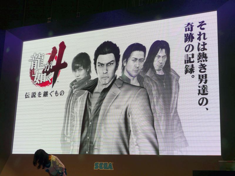
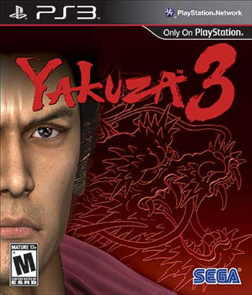
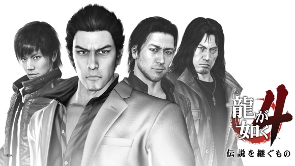 No words can describe the horror that is the Yakuza 3 box art. It is so bad that people on popular message boards were already collaborating to make a replacement sleeve before the game even came out. I'm convinced a shitty (or great) cover can considerably affect game sales, and I'm sure that Yakuza 3 would have sold better had this atrocity not hit store shelves.
Behold, the Yakuza 3 cover in all its ESRB soul patch glory:
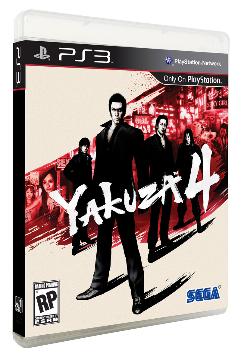
After seeing the recently revealed Yakuza 4 cover art, I'm starting to wonder if the entire disastrous North American release of Yakuza 3 was just to make Yakuza 4 seem that much better. As I predicted, Sega will not be cutting content from Yakuza 4 and they are using this “feature” for marketing purposes. Perhaps Sega won't even release Yakuza 4 on the same day as one of this generation's biggest Japanese games. Crazier things have happened.
Here is the much improved box art for Yakuza 4:




Comments
15 years, 3 months ago
That's a pretty damn cool boxart. Your reasoning it sold crappy was pretty shitty itself though.
15 years, 3 months ago
Looks great!
15 years, 3 months ago
I hate how north america focuses only on the characters for box art. The RE4 Euro cover looks great because it focuses more on the setting and the mood, as with most alternate covers.
15 years, 3 months ago
I'd hardly call the western release of Yakuza 3 "disastrous" considering that it sold stronger than the other 2 and convinced SEGA that this seemingly dead-in-the-west franchise was worth giving another shot. If anything it was highly successful by Yakuza standards, and that's despite it's box art and launch date being the same as FFXIII.
Anyway, Yakuza 4's box art does indeed look awesome.
15 years, 3 months ago
That looks awesome, especially in comparison to that first image. Maybe the Powers are listening to you after all, Brad! Now let's see where this game's marketing goes...
15 years, 3 months ago
That's what I'm talking about!!! I feel this game will sell well. I got my friend to buy Yakuza 3 and he liked it. Spread the word everyone.
15 years, 3 months ago
Epicness in that box art. better then the previous one. Hopefully it will add more to the sales. Also, why does Kazuma always have that pose?
15 years, 3 months ago
Damn thats some sexy looking box art. A big step up
Hopefully the European release will be the same
15 years, 3 months ago
I really love this new boxart and I'm glad it isn't like the abomination that was Yakuza 3's. The brushstroke effects of the shadow and background really add to the cover art. Oh and the Black, Red, White color scheme makes me feel funny in the pants.
15 years, 3 months ago
That is some sexy box art for sure. Hopefully Yakuza 4 will be better than Yakuza 3. Yakuza 3 was stuck in 1995 as far as game mechanics. The graphics were a bit better as they were stuck in 2001. The Yakuza series is a fantastic idea. I just wish the IP went to a different developer. I wouldnt even be mad if given to a western dev with some Japanese input for story.
15 years, 3 months ago
OH LAWDS.
That. is. BEAUTIFUL.
/jizz
15 years, 3 months ago
I love how the word "sex" is printed not once, but twice on the front cover.
Anyways, it's a huge improvement over Yakuza 3's box art.
Are we sure this is the North American release? What does the Japanese cover look like?
15 years, 3 months ago
Such great box art. It would definetly get my attention if it was at a store. Now I wish Kazuma will wear a black suit.
15 years, 3 months ago
I'm a bit worried that the Black, White, and Red color scheme of the cover, despite how cool it looks, is going to just let this game blend in on the shelf and not stand out too much in the myriad of other box covers with the same color scheme. It does work though. I like the cover very much.
15 years, 3 months ago
That's pretty nice boxart. i really hope SEGA found that in a thread on a forum and changed it a little.
Gawd, I hope that's the case.
15 years, 3 months ago
The cover looks good; it's dynamic and I like the subtle variation between the white text and the slightly cream background.
I do agree with Dimensaur. The black, white and red color scheme is a very common color palette. Though it is a massive improvement on the Yakuza3 cover, the new game's cover is one word: safe. I wonder what an orange would look like...
15 years, 3 months ago
Wow, looks like Sega is actually putting effort into localizing 4 instead of half-assing it like they did on 3. Please don't screw this up, Sega.
15 years, 3 months ago
Looks really good. SEGA probably satisfied with Yakuza 3 sales in us so the are not sending Yakuza 4 to die this time.
15 years, 3 months ago
Not gonna lie that looks pretty badass.
I really wish I hadn't had to sell my PS3 just so I could get my hands on both Yakuza 3 and 4.
15 years, 3 months ago
I think the box art for Yakuza 4 looks sweet, I haven't played the previous Yakuza games, so I hope this one does what Yakuza 3 did by recapping the story, it's just a nice feature for someone like me who haven't ever played a Yakuza game more than the demo for Y3 some times.
14 years, 5 months ago
[...] Yakuza 4 4playerpodcast.com [...]