Your login information returned multiple users. Please select the user you would like to log in as and re-type in your password.
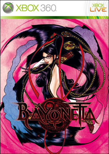
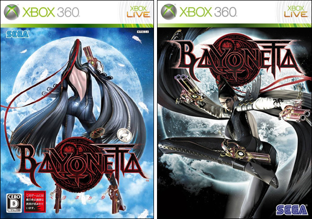 About a year ago, we imported Bayonetta so that we could get our hands on the game early. I was extremely shocked to see the artwork up close as it looked surprisingly better than it did online. I think I feel that the Japanese Cover serves a purpose, like a movie poster. I'm the kind of person to buy a game because the cover art catches my eye. I feel that sitting on a shelf, the blue glow of the box art would do a better job of standing out. It also makes me wonder who's decisions it comes down to when planning or designing the cover art. It's really an important part of marketing the game so that raises the question, Does this box art not appeal to me because it's bad? The makers don't know what they're doing and are untalented. Or is it trying to appeal to someone else? Case in point.
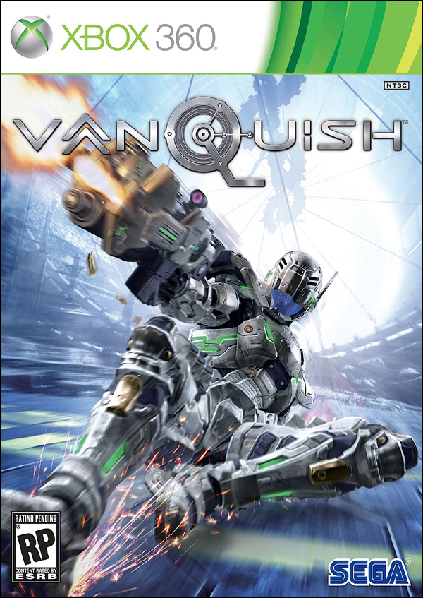 Not to get too far off the topic of Bayonetta, but if you look at the cover art for Vanquish, the Platinum Games Release this week, it's a picture of the guy sliding and shooting his gun. To most of us that makes sense and it's not a bad cover. But recently while talking to Brad, he voiced his opinion that it's not that great. Now I don't know if I 100% agree with him, but I do think he brings up a good point and always it's extremely important to listen to differing opinions. So his argument is the guy in the Vanquish cover is not going to be appealing to most people just walking in and looking at it with no previous background. We are aware of how the games plays but they may or may not be able to immediately tell that he is sliding due to that stylized mechanic. So if you just look at it without that context, it looks like a big tough soldier in a afeminite ballerina pose. That will confuse the men who play Call of Duty and Gears of War and they won't have that in their game. I think it's at least an interesting way of looking it, but again I'm not completely convinced that will be the case.
So that's the cover art comparison for the week. Below you'll see an alternate Bayonetta that was on the back of the Japanese Platinum Hits Release. Also I think it's worth mentioning that Platinum Games released Bayonetta in America earlier this year making Vanquish their second major console release. That's a lot of games for one developer. Also I wanted to strictly do a Vanquish comparison but I think cover is going to be the same in both regions.
Thanks,
David
Last Week's Comparision: Breath of Fire V

Comments
13 years, 6 months ago
It did take a moment for me to realize the guy wasn't laying on his back shooting, but sliding.
To me though, the cover is appealing in the sense of the ammount of detail they put into the suit. I mean, look at the mastercheif armor from the box art of of any halo and then look at vanquish. worlds different, atleast to me.
13 years, 6 months ago
I like both but I think Bayonetta was about the character and so much of her character was in her face which is obscured in the Japanese version.
The look of the second cover better suits the character and game.
While the first has a more classic pose it those not convey enough.
As for the third cover too shocking to the eye even though it shows her playful side
13 years, 6 months ago
I will agree that Brad does have a point. The problem I have with the Vanquish cover though, is the coloring. I don't feel like there's too much color contrast so to me, the cover looks a little blurred together since nothing really "pops out". If I was scanning a rack of video games, and I had no prior knowledge of Vanquish, I might not even notice the game.
I guess that's why I like the Japanese Bayonetta cover, since Bayonetta and the title contrast nicely with the blue background. Though, the alternative cover has quite a bit of contrast as well, I think is a little...excessive? >_>
13 years, 6 months ago
I think we need more painted covers. Just look at the awful cover used for Mount and Blade (Sorry don't know how linking works here): http://img514.imageshack.us/img514/1309/92939399197frontwd2.jpg versus the game artist that they had the full use of, Ganbat: http://farm5.static.flickr.com/4063/4438701149_606156ff57.jpg
Should have been a no brainer. As for the 3rd bayonetta cover, It was done by Adam Hughes (which I saw leaked long before it was published) and I think he nailed the feel of the game/character. In a world of brown games and "gritty" over-detailed covers, a big block of pink broken up by that black will really turn some heads and dominate the shelf.
13 years, 6 months ago
Why does America always get the crappy cover art?
13 years, 6 months ago
I agree with David. A game's cover holds some weight when sitting on a shelf. I love Mass Effect 2, but the cover was horrid! I really like what Sega is gonna do with the Yakuza 4 cover.
13 years, 6 months ago
You know I might start blowing up and switching all my covers because these are just so cool. On Gamefaqs they, more often then not, have all the different cover images and I always like the Japanese or European better then American. The effect is the same as the painter Drew Struzan. When Drew paints covers for music, film, anything really. He captures what that thing is. Look at Indiana Jones or Blade Runner. Japanese covers seem to do this same thing for me I mean just look at Ico or Breath of Fire V. When I saw the American cover of Ico I was dumb struck it was so bad. Some covers get it right however. Lke Halo Reach or the GTA games.
13 years, 6 months ago
With the Bayonetta art, I do like how the Japanese cover kept the "mysteriousness" of Bayonetta. It makes you wonder "Whoa, what's this woman about?" so it kinda draws you in. But the American art is really "Oh, what's with this lady trying to kick me in the face?" and it takes away the mystery of who she is. If they wanted to show who she is the American cover could at least capture her more playful yet violent side.
And for Vanquish I wish they could actually show where he is and what he's shooting at. It just shows him sliding(laying down) and shooting. I know he's the focus of the game but it'd be cool see him in a clearer environment while fighting enemies. Like, shooting and boost punching enemies in the face. Or even show him facing one on one with bigger enemies or more ferocious enemies. If war has accelerated, you gotta show how action packed it is.
13 years, 6 months ago
I really love this series of posts. There have been several occasions where I've seen box art for a game and wondered why they went for that look...and not something else. I have never seen the Japanese cover for Bayonetta and I gotta say...I wish I had the chance of buying that instead of the American one.
13 years, 6 months ago
I agree; the Japanese cover is much better looking.
Honestly, there are a lot of game covers that look the same. There's a lot of black/white/red color palettes and an occasional grey/blue. And I totally agree with specdotsign about the ME2 cover. It was absolutely horrible.
I think that developers need to start asking their designers to take risks to really make the covers unique. Often times, a cover would look better as a poster than a game cover; the reduced size tends to make a lot of the covers not as effective if they were blown up.
Personally, I'd love to see more illustrators do game covers instead of just having an in-game model rendered on the front cover.
13 years, 6 months ago
Cover art comparison series has always been one of my favorites. It really is intriguing to see what we could have gotten instead, be it bad or good.
13 years, 6 months ago
The only real issue I have with the Vanquish cover is the lack of contrast. The background steely blue blends too much with the character's suit, so it doesn't really create much visual excitement. Of course that's exactly what you get in game too, so I can understand the concept.
13 years, 6 months ago
"But recently while talking to Brad, he voiced his opinion that it’s that great." Did you mean "NOT that great"? Since the next point that comes up is that it sort of gives people the wrong idea about the cover and not exactly knowing that he's doing a power slide? I'm not trying to say I don't think the cover art is cool, because I do like the design of the armor (except for the few misplaced greens, but maybe that's just me), just wondering if that was just a small error.
13 years, 6 months ago
[...] Last Week’s Comparision: Bayonetta/Vanquish [...]