Your login information returned multiple users. Please select the user you would like to log in as and re-type in your password.
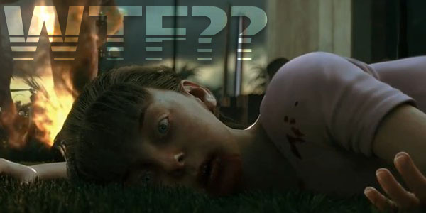 Dead Island, the highly anticipated open-world, zombie killing game launches early next week. Often described as a cross between Far Cry 2, Left 4 Dead, and Dead Rising, the game definitely has a lot going for it. With that said, I am growing more and more concerned following the recent release of Call of Juarez: The Cartel, a game from the same studio that was torn to shreds by critics. With more than 5 years in development and a significantly larger budget and development focus, I think it is safe to say that Dead Island's fate is not hopelessly tied to that of previous projects. In the final days prior launching, there is only one aspect of this product to dissect: The cover art.
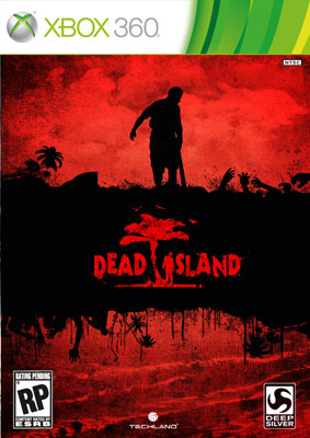
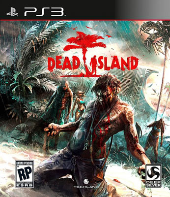
As a collector or connoisseur of video games, attractive packaging is just as much a part of the buying experience as playing the game itself. Thanks to a nifty little promotion offered at Gamestop in which pre-order customers are automatically upgraded to the special edition, we will be treated to two different versions of the cover artwork. Unfortunately for Dead Island, someone forget to tell someone else that "special edition" packaging should be perceived as an added value. How someone let this happen, i'm not sure but one thing is for sure, I am actually contemplating downgrading to the regular edition so I can get my hands on the proper cover art. Take a look: (Left: Special Edition / Right: Regular Edition)
Am I crazy? Why would a company want to deprive their audience access to such wonderful artwork? In fact, I would say that Dead Island's cover art ranks among some of this years best. On the flip side, the special edition art is boring and uninspired by comparison. Is an exclusive DLC pack worth taking a hit on the artwork? Will the special edition feature the original artwork on the other side? These are the questions that I will continue to wrestle with until next monday night. What do you think?
Comments
14 years, 3 months ago
That just messed up. But it seems most special editions these days have a mono-color and shiny box to them, but for the regular to outshine the special edition is just so faulty.
14 years, 3 months ago
Although I like the Special Edition's more minimalistic approach box art , I agree that the normal box art is better.
14 years, 3 months ago
I may be the dissenter here, but I like the simplicity of the special edition cover better. The regular edition seems a little too busy, so much so that the title almost gets lost in all the action.
I usually prefer stark artwork though so this is all going to come down to personal preference.
14 years, 3 months ago
I think I like the special edition box better. Guess I'm just weird.
14 years, 3 months ago
Am I allowed to say I like both of them? I will admit though, the normal artwork looks better. :P
14 years, 3 months ago
Yeah, the special edition reminds me of Resi4's special edition cover.
That might be why I prefer it than kneeling man.
14 years, 3 months ago
I'm going to have to disagree on this one. I prefer the special edition art.
14 years, 3 months ago
yeah i agree with joseph, j52, and will.....the special edition is more appealing to me. It's kinda like the whole simple original portal cover compared to what we got for portal 2"s cover. The actual box art is too busy. I like the special editions red and black....does the title justice.
14 years, 3 months ago
I like both. The special edition is simple and it leaves me with questions; which I really like. But, I'm also very content with the normal art; instead of just a zombie taking a break, I see a zombie just finishing up a wicked powerslide. They should give that dude a guitar.
14 years, 3 months ago
I like both as well, but I prefer the non special cover. I did notice though that there is really nothing to separate the elements from one another. I like the pairing of teal and red, but the fact that everything has these colors can blend them into a blob rather than representative figures. A little atmospheric fog to separate the mid ground elements from the foreground zombie and to push the hotel a little further into the distance would do wonders for the cover. They are both fine covers, and Nick who is to say that the special edition won't have a poster of the other art included or something along those lines?
14 years, 3 months ago
I have to say I'm not a fan of either artwork, the original is better. The special edition is a little too generic while the original is way too cluttered. I think a balance between flash and minimalism is the best approach.
14 years, 3 months ago
Not the first time I disagreed with 4pp's cover choices but; yes nick, you are blind. or at least we're all blinded after looking at the overexposed harshness in the colours/lighting of the standard edition's cover. It's terribad compared to the special edition.
I've seen enough game art to have a healthy hatred of SUPER contrasted colour and value, the gritty pasted-on texture and harsh nonsensical lighting is there just to make teenager think it's "WOW soo cool and dark". The image on the right is far from the best artwork this year, there's just nothing.... "to" it. The values are too harsh the lighting makes no sense (where are those 2 lightsources?) the shadows would never be that dark for the time of day, and there's no TONE to it.
That's the worst thing, I can't decide what that art is supposed to make me feel. Random zombies heading in a direction in a storm - no sense of danger since they're not coming at us, no sense of empathy since there's no human characters to be seen. What's that zombie in front actually DOING? He's just kneeling down in a pose that's supposed to make him look "cool."
The left one on the other hand, I know what I'm supposed to feel; dread. Single colour, deep blood red, blackness everywhere else. A single survivor is struggling with his weapon, and we instantly feel as he's someone who in for a bunch of shit.
While the one on the left is more visually simple, it gets some emotion across much better. The other one is so conceptually simple it may as well be dead. but it's got harsh lighting and blood and zombies curling their fingers so it'll sell copies to teenagers with boners for blood. Sometimes I hate this industry.
14 years, 3 months ago
I don't really like either of them, just the cover of the standard edition looks so cartoony or just plain badly drawn.
14 years, 3 months ago
Oh my GOD, the non special edition looks amazing.
14 years, 3 months ago
It appears that I will have to join the masses on this one. The regular edition is so unoriginal and predictable. I think I'll have to chalk this one up to your penchant for gore and fucked up shit.
14 years, 3 months ago
I like the special edition better actually...
The normal one just looks like a poster with the game's title on it too me.
I'm not saying that it's bad, but like Joseph said in his comment, it look too busy for me.
14 years, 3 months ago
who the fuck care about what the box looks like.......
14 years, 3 months ago
Heh, special edition reminds me of Raw Danger for some reason, but ya the left one this time looks brilliant.
14 years, 3 months ago
I prefer the more detailed cover art for this one.
I am beyond sick of simplistic covers, especially for horror themed games. The standard edition does what it needs to do; It shows the setting, a tropical paradise in ruins. The alternative is just a repetitive blob of red and black used by almost every other developer/publisher trying to make their product look dark and gritty. It's uninspired.
In short, the regular edition looks like a poster you'd see for a film while waiting in lines at the movies and the special edition looks like the cover for a dvd of a B-horror slasher that's been on the shelf at blockbuster collecting dust for half year. That's my opinion anyway.
14 years, 3 months ago
If they had had a bigger tree that the man/zombie is hanging from on the 360 version, I think it would be better.
14 years, 3 months ago
I actually didn't get which one of the covers do you want most.
But I like the red one best, so buy that one. xD
14 years, 3 months ago
I perfer the special edition box art( I'm guessing thats the red one). I do like the art style of the standard edition, but there's just to much going on.
14 years, 3 months ago
Eh, no big loss for me, because I know that art for the normal edition is great. Trying to convince my local GameStop to let me have one of the posters showcasing it, so in the end, I'll come out with a both art packs; I do wonder why they didn't have another picture commissioned for the special edition, though.
14 years, 3 months ago
Put me in the boat that thinks the Special Edition looks way better. The standard box just looks like a complete mess to me.
Eh, different strokes.
14 years, 3 months ago
I prefer the cover without the retardedly posed zombie.
14 years, 3 months ago
It really wont matter, you will still be playing the same game. So bring it on! :D
14 years, 3 months ago
For once, I'm glad I forgot to pre-order a game...
14 years, 3 months ago
i have to disagree with nick on this one, where i've agreed with him for so many other things!
from a design student standpoint, all i hear is "keep it simple, the simplest idea is the best, simple ideas are often the most dramatic." which is why at first i thought the horrible special edition cover was the right picture. to find out it's the left picture, i think that makes sense. a simple idea works best always, and here it is no different. the colors on the regular edition are too varied and too competitive with one another to make it anything higher than a fanart piece on steroids. i am disappointed that anyone would think that was a good cover. i had to zoom in just to see what the heck was going on! i do however, think that the special edition cover should be the regular cover, but the regular cover should be thrown out all together.
14 years, 3 months ago
I don't really like either of the covers, to be honest.
14 years, 3 months ago
As long as the game is good I don't care what the box art looks like. I'm not paying $60 for a piece of art to hold my disk.
14 years, 3 months ago
I really like the special edition cover, but the regular just looks like a clusterfuck. That said, fuck launch DLC.
14 years, 3 months ago
tbh i like both, although normally i am always for a minimalistic approach
14 years, 3 months ago
I wouldn't mind having the SE cover as a poster....
14 years, 3 months ago
Do you know what I miss? The hanging, dead body that originally made the I in Island.
I want that back.
14 years, 3 months ago
Dancing zombies on the regular boxart, what is not to like?