Your login information returned multiple users. Please select the user you would like to log in as and re-type in your password.
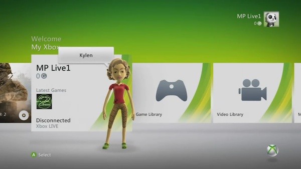
I hope you all had a good Halloween weekend? I sure did and it took me all of yesterday to recover. But I'm back! And when I returned I found a whole new dashboard for my xbox. Yes the one to usher in the KINECT!! (jazz hands).
Sure, I knew it was coming but I wasn't under the impression that they were going to make my xbox part Wii now. So what are my first impressions of the new Dashboard?
- There is simply too much white. Most people are using this thing in low lit rooms and the white is just too bright...distracting even.
- I despise the neon-orange header that is on the profiles now. Especially with all that WHITE. It's just a terribly color choice and a bad design decision.
- I actually like the new sounds better. Yes, they are 100% Wii sounds, but they are more pleasant than the old ones.
- There is some menu lockup going on in certain areas, especially around the "games" area, but I'm sure that will be fixed in a patch.
- The menu's seem punchier now, they seem to click into place and just move better overall
So what do you all think? Hate it? Love it? Growing on you like a cancer? Sound off in the comments.

Comments
13 years, 5 months ago
Ick. The old one was much, MUCH better IMO.
13 years, 5 months ago
Great, now it goes from looking slightly like the ps3 dashboard, to looking almost the same.
Smooth MS, smooth indeed.
Frankly I liked the NXE dashboard better then this.
And I liked the blade style dashboard better then NXE.
13 years, 5 months ago
I was in the beta and the white seemed blinding for the first couple of days. Once I got used to it, it was no longer annoying. In fact, when I turned on a console running the old dash it felt dark and a lot of the small changes they made to make the thing feel a bit a bit speedier were very noticeable when taken away. I like it.
13 years, 5 months ago
I'll say this as a graphic design student: the new menu is awful but it is very much "in style" with current designs. What is in style is varying shades of gray, silver and white (examples of this can be seen from Apple and the Wii). I believe that this design is all about universal accessibility, most notably for the kinect audience.
What I would *love* to see would be them including a choice to change the transparency and color of the bleached white squares. Perhaps they could give people different themes like they do in windows. They could change the font color, window color and the color of the xbox 'swoop' to a design of the user's choice.
Anyway, I agree with all the points you made. I think the part I have the most problem with is the headache-inducing white.
13 years, 5 months ago
It certainly is faster but I hate the color choice. Why arent we allowed to customize it the way we want it. Cmon Microsoft.
13 years, 5 months ago
I like it in general, though largely due to the fact that all of the icons are the same size, rather than scaling off into the distance. In general, it seems a bit cleaner and more like a game system, and that's a good move in my book. The persistence of the ad mess even when you're paying $60 per year for a Gold subscription remains disgusting. I've also had my XBox freeze up twice so far in one day just browsing the menus, which doesn't give me much confidence, and my game library still takes around twenty seconds to load, but that's more likely due to the slow, crappy drives MS puts in their consoles.
I have to say, though, the new Zune interface is friggin' amazing for anyone with a Zune Pass. It's unfortunate that you can't download tracks, but the ability to browse the Zune Marketplace at will, with all of the music discovery tools on offer, with a slick, classy interface is a much larger addition than I had anticipated. Great job there, MS!
Overall, I'm pleased with the update, even if it remains a far, far cry from the PS3's XMB. But hey, variety is good, and the little touches of Rare's influence are always welcome.
13 years, 5 months ago
I think it is an OK update. not a lot has changed. However, it is far more responsive and faster than the previous one. My only real complaint is that to now view everything in a category you need to scroll through the alphabet each time just to select the ALL option. Anyway I think it is good, but feels more like a new lick of paint rather than something completely brand new.
On a completely different note, will we be hearing about a wild Halloween on a Cocktail Time any time soon?
13 years, 5 months ago
I think it's fine. It's certainly better then the previous one which had a tunnel effect (Slant and such) I'm not loving the colour pallet. The brightness isn't a problem (Playing in the dark is bad for your eyes *,..,*) but the colour choice is. New sounds are pleasant, simplistic and overall better to listen to than the previous.
I like :D
13 years, 5 months ago
Gross. Their decision to make all the menu items the same size instead of getting smaller out into the "distance" makes it very difficult to quickly scroll through the list of choices while still being able to read all of the available options. This is extremely evident when quickly browsing through pages of games by achievement. I am now forced to scroll a couple games then stop, scroll a couple of games then stop, etc. just so I can tell what the boxes say. Before, you could always tell what the next couple of options were before you got to them.
There is still no wraparound feature when browsing a single game's achievements. If you hit the end of one line and press right again, you should be taken to the beginning of the next line.
I also think that the choices to make all the shapes blocky and to remove the outlines around objects makes everything much more simple, however, simple and visually appealing are not always positively correlated.
More customization of the dashboard would indeed be appreciated.
Overall, I feel like this is a step backward, perhaps if not in overall functionality, then in visual coherence. And as a computer programmer myself, I, unlike Microsoft apparently, realize that visual coherence affects funtionality.
13 years, 5 months ago
I'm not bothered by it. I always welcome change. My problem is one that you stated, Joseph. Microsoft really is trying to become the new Wii. Have you seen the Kinect videos they have up on the dashboard? Holy balls, it's maddening. Anyway, it's just aesthetics, not a big deal if you ask me. I foolishly went through the tutorial thinking I'd receive some cheevos, and I'm not even a cheevo whore (trophy whore, yes ^___^), haha.
13 years, 5 months ago
I will hold back my 'rage' and simply post this..
http://www.youtube.com/watch?v=Eg8cDmi7-U8#t=1m20s
13 years, 5 months ago
At least they aren't making you use the Kinect to browse the menus. I'm sure that will be added later on, but we're safe, for now.
13 years, 5 months ago
I'd like it if I could find the fucking Indie Games! They're suppose to be in the Specialty Shops, but I still can't find them. Any help? o_0
13 years, 5 months ago
I still prefer the PS3 menu, a lot simpler and just overall better looking.