Your login information returned multiple users. Please select the user you would like to log in as and re-type in your password.
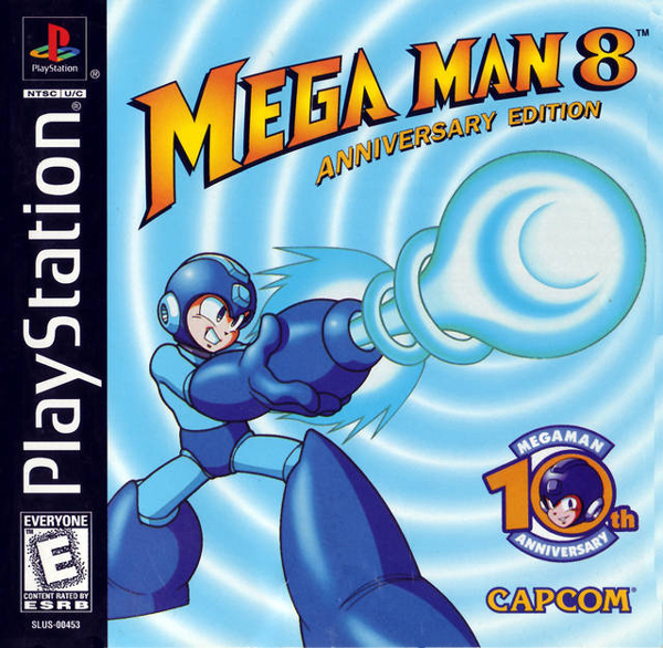 With the recent departure of Inafune Keiji from Capcom, It'd only be fitting to dedicate this week's Cover Art Comparison to one of his most influential projects. Mega Man on the NES has always been known as the game with the horrible Box Cover. On other consoles however, it's not the case. Above is the Cover for the American release of 10th Anniversary Edition of Mega Man 8 for the Playstation. I think there's also a regular version but the only difference is that it doesn't have the things saying Anniversary. This is the cover that I'm used to but I've never been all that positive of it. I definitely think it's missing something. I mean seriously, who does backgrounds like that? Even a white background would have done a better job of accentuating what's going on. But hold that thought as I'll make a mention about it later. Below you'll see the Japanese Cover for Mega Man 8.
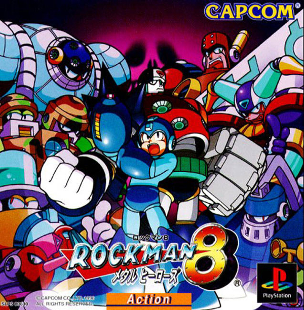 If you didn't know, Mega Man in Japan is called Rockman. It goes along with a music themed naming for all the protagonists in the series. Mega Man is Rock. His female counter part is Roll. His Prototype brother is actually called Blues in Japan. There's also a dog named Rush, a Cat named Tango, and a bird named Beat. It's actually pretty cool when you realize what it's referencing. As for the Japanese Cover, I really can't say that I'm a fan either. Thematically I like it better than the American Cover. I always love busy covers compared to plain ones. I love it when a Cover has a bunch of characters/bosses all pictured on the front. But I think in this case, there's nothing going on. Usually when artists do a cover like this they all crowding over the main hero, as if they're all trying to get him. It's a much more menacing feeling so you feel the overwhelming odds. But if you look at the surrounding robots, they're all looking in different directions, as if they're uninterested. If anything, I think maybe those were character art used for producing the game and someone just photoshopped them together surrounding Rockman. That could also be the reason for a lack of distinction between the hero and the other robots. Oh yeah, one last thing, I LOVE the bottom classifier. It says Action so that video game buyers know what kind of game it is. It's an interesting thing Japan does and I wonder how well it actually would work here in the states. Quite honestly in Japan, it's kinda necessary. I've seen games that look amazing from their covers and then go home to research them, only to find that they're some sort of puzzle or word game.
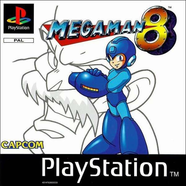 So my pick this week is for the European Cover. I love the simplicity and contrast between color and the white. The one thing that drives me absolutely insane about this cover... WHY IS MEGA MAN COVERING HALF OF WILY'S FACE??!?! He's got his mega buster right over his left eye, it's maddening to know someone actually approved a cover like this. If they would have just shifted Mega Man over a smidge and had it covering his ear, that would have been perfect. Who cares about seeing his ear? But for some reason they show that without fail. It baffles my mind how these decisions get made. Well thanks for showing up this week.
Hope you enjoyed it,
David
Last Week’s Comparision: Lost Planet 2


Comments
15 years, 1 month ago
I have to go with the American cover this time. I just love the simplicity of the cover. While it may be a little dull, I just really dig it for some reason. The Japanese version reminds of a CD cover. Very good Comparisons this week David!
15 years, 1 month ago
I'm going to have to go with the Japanese cover as my favorite. It gives off a haunting feeling (look how tiny Megaman is compared to his enemies) with a sprinkle of badassery. EU cover would come second for the same reason that David mentioned. As for the American one, that is just typical. Main character doing one of his signature attacks or a random explosion in the background is the pre-requisite to pass as a game box cover in the US.
15 years, 1 month ago
Well, EU cover is definatly better then the US one just because it doesn't have a blue character on a blue background shooting blue beam. JP cover is also good, but like you said, there's nothing going on. So my pick is for EU cover too.
15 years, 1 month ago
I prefer simple covers over crowded and action-y ones. So European it is!
15 years, 1 month ago
The Japanese one kind of makes it seem like the bosses are fighting along side Megaman. Like they are a gang.
15 years, 1 month ago
I like the Japanese one out of all of them the most. Probably because of my thing for anime but also as well for the way I see it. It seems to me more like they're standing behind him like they have his back because you can call upon their power after you've defeated. Not sure if you get there powers in that Mega Man series because I could never get past one level, I've always been a Maga Man X man myself.
15 years, 1 month ago
Oh wow I never knew all the musical references in the Japan version...
15 years, 1 month ago
I'd like a combo of the megaman from the American cover with the background of the japanese cover. I think it would look good
15 years, 1 month ago
I don't have any strong opinions about the covers to share, but I never really liked the name Rock Man, because the robot master names describe what they are or what they do, but Rock Man has nothing to do with rock music, rocking-out, or even rocks (though maybe you could say his shots are like little stones). Though from Mega Man Powered Up (PSP), it seems like the in-universe reasoning was he merely stuck "Man" to the end of his name (Rock) when he began fighting. The English translation retconned his civillian name from Rock to Mega.
I think it was Inafune who said he didn't like "Mega Man" because it sounded like an American comic book hero name, but it means "large/great" or "1 million" which I think fits with his ability to make use of lots of weapons and tools. Kind of like one of his rejected names: Rainbow Man, only it sounds better.
15 years, 1 month ago
i like the japanese over the american, the amercian cover is just boring and the european is definitly cool looking has a lot of perspective
15 years, 1 month ago
I like the European one the most. I feel that the American has too little, while the Japanese one has too much (possibly because some of the robots are huge), and the European one is just right. I agree that covering his face was a bad move though. Maybe if they just had his face a little smaller in the upper left, with Megaman a little to the right. But that may've looked too cheesy, and then the white background would stand out too much.
15 years, 1 month ago
"I'm Clown Man!" da na -na-na-na
15 years, 1 month ago
Thanks for the JP Megaman lecture David. I also prefer the EU cover because of it's simplicity. Also a bad ass Wiley in the background.
15 years, 1 month ago
[...] Last Week’s Comparision: Mega Man 8 [...]