Your login information returned multiple users. Please select the user you would like to log in as and re-type in your password.
 So this is a big one this week. One of my surprise games this year, Lost Planet 2, was a multiplayer experience that should have only been play with three other people. While not super engaging in story, most of the size and situations during sequences of Lost Planet made it pretty memorable for me. Couple that with a few fixes of major problems from the first LP and you have a game that will probably make my top ten this year.
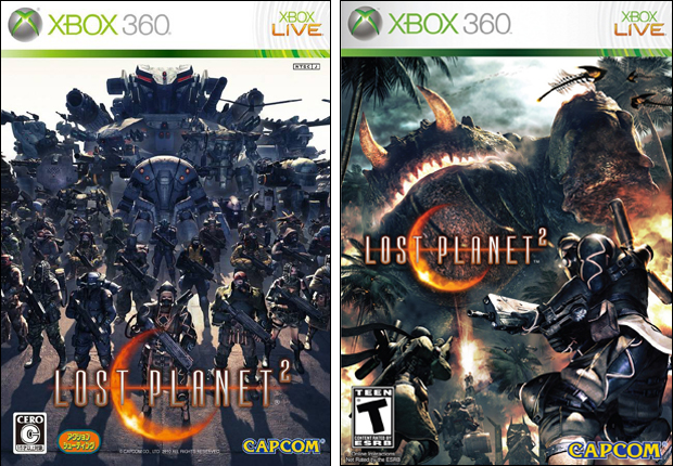
Now, I've seen the American cover for Lost Planet 2 multiple times, but never did I understand what I was looking at. It wasn't until I downloaded a large resolution version for this feature that I finally put two and two together. It's the big salamander boss towering over some troopers who are running away. Kinda boring. I get that they're trying to show off the size and scale of encounters but I hardly think it shows well on a six by eight inch video game case.
I'm not extremely positive on the Japanese release either though. I don't think it's great a capturing the eye but at least it does help to characterize the game's team mentality. You're just another soldier. As you play multiple factions, it's easy to be lost in the mix as you're always just a faceless person behind the mask. That made it easier to jump around the story and less awkward when they killed a person off. But that also made it more difficult to give a damn about anything story related. At least that's how I felt coming off the game.
My pick this week is for the Japanese Cover (shown left). It's not fantastic but I definitely like it over the American release. There at least some contrast between the white and the dark. And you can tell what are soldiers and what is machinery. The American Box Art however, just looks like one big swirl of darkish gray.
See you next week,
David
Last Week’s Comparision: Bayonetta/Vanquish
Comments
13 years, 6 months ago
I actually have to disagree with you on this one, David. The American cover art, though laden with a few problems, is at least more interesting (to me) than the Japanese version. I much prefer the 'in medias res' approach to cover art over a simple still of a character or group of characters facing the viewer. This is quite apparent in the Japanese version, which comes off as fairly bland and boring to me.
Of course, the American version has its own flaws, too, which you have pointed out. I really didn't know that was the giant salamander at first, either, but at the very least there is some action occurring to draw the viewer's attention. If they defined the salamander a bit more, made it stand out from the forest in the background, it could have made for a much superior cover art.
Keep doing these comparisons David. I always enjoy them, oddly enough, and always like to see Japan and America's approach (though the trend seems to be that Japan knows how to construct them better). It's always interesting to see one where I prefer the American's edition.
13 years, 6 months ago
I prefer the Japanese cover, I had to stare at the american version like 10 seconds to find out what was going on.
13 years, 6 months ago
Yea i also have to go with the American cover. The game is quite over the top and i think that the American cover portrays it well.The Japanese cover seems a little too uniform for what the game is about.
13 years, 6 months ago
I have to agree with David to some extent. The American cover is a bit of a mess and it is hard to understand what you are looking at. On the other hand, the Japanese cover art isn't much better and as Zocano pointed out is pretty bland and boring...
13 years, 6 months ago
Hmm, nice comparably. Out of mot of the Cover Comparisons you do; this one is one of the harder ones for me to distinguish which I like better. Though the Japanese Cover has more contrast, the US Cover gave me a more action-orientated view of the game. (Though I thought at first they were running TOWARDS the Akrid) This one will just have to end up being a tie in my mind.
13 years, 6 months ago
i like the american version but it is confusing and i can see the appeal of the japanese one. neither one is great i just like the american one better at first glance
13 years, 6 months ago
I'd have to go with the american version, the japanese version wouldn't pop out at me when I'm looking for a game. I can't tell if its a shooter or a rpg by the japanese cover but by the american cover its pretty apparent that it is a shooter and just seems more interesting to me.
13 years, 6 months ago
I think the American cover art has a greater range of color, and although it is that typical 'American' style of action cover I think it fits what the game ultimately is. A game where a group of soldiers fight giant monster bug things. I could tell what was going on in the picture immediately, but I think that is because I have seen many commercials depicting that particular monster when the game was coming out.
The other cover, while very nice in it's own way, I think gives the impression of something more militaristic in nature, if that is understandable. It makes it look like it is going to be a military drama or something to that effect. Hell, gameplay characteristics show up in both covers too as I think the American cover even shows the fact that it can be potentially cooperative in nature while the Japanese one makes it seem like a RTS. The Japanese cover does not even show what they are up against, which is arguably the hook to the game in many ways. Also the monotone coloration of that particular cover gives a serious vibe that I don't think Lost Planet 2 necessarily portrays.
This time I'm going with the American one.
13 years, 6 months ago
Sorry David but I will have to disagree as well. Whilst neither case is excellent, the American case is the more eye catching thing to see on a shelf, compared to the Japanese were it looks a little bland. Plus something about the Japanese version makes me think of something different (not sure what), whilst I reckon the American art represents the game better with the small team of players and playing around with the scaling of the game.
13 years, 6 months ago
Every time. Every single time Japan gets the cooler cover.
13 years, 6 months ago
I like the symmetrical feel of the japanese cover.
But eeeh, I think they're both pretty ugly covers for a subpar video game.
13 years, 6 months ago
I'm more of a collectors edition searching person for games I love.
I LOVE cool concept art from games, most the time alot is lost in the translation to the actual engine which usually sad, but for the better due to gameplay.
To me, Japanese Coverart would've caught my eye more.
Japanese Cover says "This is your world, giant shit, and all your army at your back" All while making a neat and stylish art.
While the American Art is probably more true to in-engine experience.
I hate that look of, In-game screenshot with text over it.
13 years, 5 months ago
[...] Last Week’s Comparision: Lost Planet 2 [...]